With Muni Forward, the San Francisco Municipal Transportation Agency (SFMTA) has been actively working to create a safer and more reliable experience both on and off transit. Muni Forward brings together in one place a long list of projects to achieve this vision. These efforts include: route changes and service improvements (like transit-only red lanes), improved frequency and reliability on the core routes that serve nearly 70 percent of all riders, an updated fleet of transit vehicles, improved safety and accessibility in line with San Francisco’s Vision Zero goals, technology to integrate transit with traffic signals and bring real-time information to riders and, last but not least, a new map for Muni.
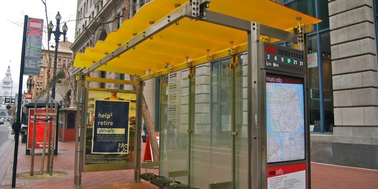
This month, Muni Forward will introduce a new transit map designed to give riders more information at a glance. The paper map will appear in a bus shelter near you by the end of the month. First exhibited at SPUR in 2014 as part of our exhibition Urban Cartography, the new map, created by Jay Primus and David Wiggins, makes the complex web of San Francisco’s 82 municipal transit lines far easier to use and understand. Primus, a transit planner, and Wiggins, a cartographer, had bonded over mutual frustration with the old Muni map while they were both working for Nelson Nygaard and decided to tackle a redesign as a pro bono project.
That was nearly ten years ago. Back then, the map-obsessed pair looked to simple design principles to guide the arduous evolution of an established and decades-old document. They began by combing through more than 300 maps from around the world for inspiration and ideas. Primus explains that the map incorporates “a bit of Japanese design, a bit of Mark Twain.”
An overriding goal was to say more with less. On the new map, landmark names were taken off, but because San Francisco has such a small footprint, it was still possible to name every street — something that would not be feasible for New York or London. This enhances the map’s usefulness for pedestrians, not just transit riders.
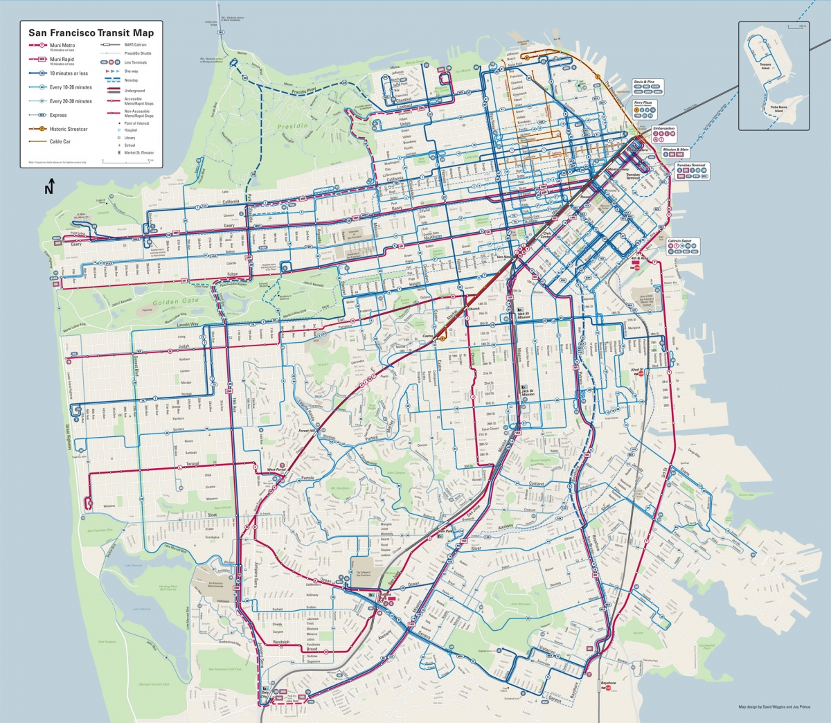
The map’s big move is to visually communicate one of the most important aspects of transit service for users: transit frequency. On the old map, there was no telling if the 2 or the 38 was more important. Now, line thickness and color are used to indicate how often a bus or train arrives. A darker and thicker blue line indicates a more frequent route (like the 22), while red lines mark Muni light rail (like the N-Judah). Different font sizes and colors differentiate major streets like Divisadero from smaller ones. In this way, the new map communicates dramatically more information than the old one.
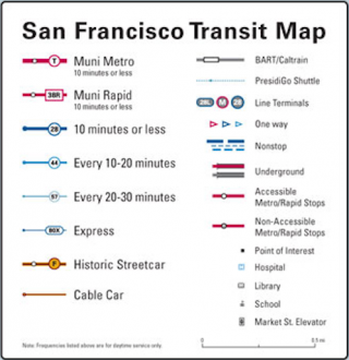
The legend for the new map shows how line thickness is used to indicate frequency.
At its essence, Primus believes, the new Muni map is a guide for leaving the house in the morning without a car — and without a digital device, as it was specifically designed to be a paper map. “It’s a matter of cost-effectiveness that we don’t have digital screens in every subway station and bus shelter, but you can also communicate more information in print,” he says. “We can give these away instead of forcing people to have smartphones. It’s like reading a hardcover rather than a Kindle.”
The map is a perfect example of a simple, cost-effective way to improve usability for riders, one of the key recommendations in our report Seamless Transit. By making transit easier to understand and access, we can increase ridership and meet our goals for a sustainable region.
Download the new map as a pdf >>
Read SPUR’s Seamless Transit report >>